

Could your website be working harder for you?

Not every successful experiment wins first time. In fact, some of Newmarket Holidays' biggest improvements came from tests that initially showed little or no impact.
Across the first nine months of 2026, we ran a series of A/B tests with Newmarket Holidays to understand what helps people feel confident booking a holiday. By digging deeper into the data, challenging our original hypotheses and iterating on our ideas we drove significant value from the program, delivering over 1000% ROI.
Some of our biggest wins came from tests that didn't win the first time around. Rather than moving on, we looked at the data to understand what users were responding to and engaging with, identified where the original experience was falling short and tweaked our test.
+9%
Average key-metric uplift
+11%
Conversion rate uplift
1255%
Program ROI
Our first test moved accommodation information above dates and prices on the product page. Clicks to view accommodation increased by 21%, but checkout starts and bookings didn't increase alongside them. This test helped us to confirm that users wanted to explore the accommodation options and that this was a key decision driver in the process. Those who missed the accommodation section on the PDPs, only had that information surfaced at the point of checkout which we believe was driving the high checkout abandonment rate.
Accommodation details were hidden inside a text-heavy pop-up, adding an extra click and interrupting the flow of the page. For the second iteration, we replaced the pop-up with a static, icon-led layout that made the information easier to scan and available by default on the page.
Test 1:

Test 2:
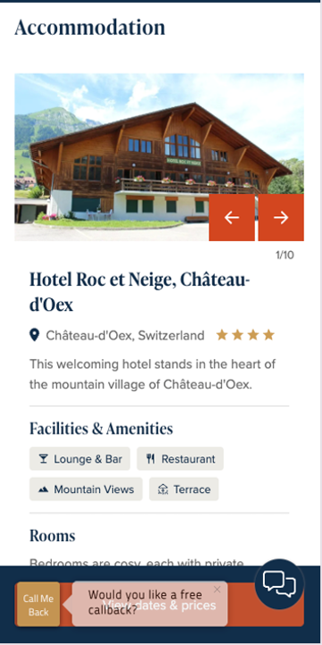
The result? purchase rate increased by 42.7%.
The learning? When engagement increases but conversion doesn't follow, look at how the content is presented before abandoning the idea. A lot of CRO teams would have stopped once engagement had increased but we knew based on the data there was more value to drive from this area of testing.
We initially tested reassurance messaging across a range of pages across the site, include pages as part of the search journey as well as part of the checkout process. The results showed no clear positive impact, with a slight drop in checkout starts and a slight uplift in checkout completion rate.
Rather than abandoning the idea, we focused further on the messaging in checkout based on the slight increase in completion rates, where customers were closer to completing their purchase. By focusing the message on users further down the funnel, we made the reassurance more relevant to the decision they were making.
Checkout messaging added:
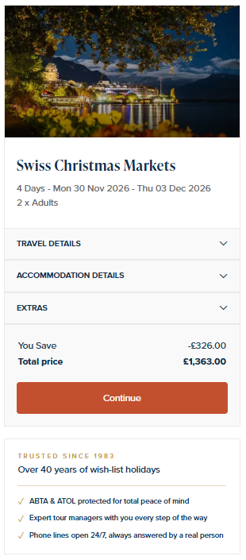
The result? Purchase rate increased by 21%.
The learning? The right message can have very different effects depending on when users see it.
Our initial email capture test delivered a slight uplift in sign-ups, suggesting the idea had potential, but the messaging wasn't giving users a compelling enough reason to act.
For the second iteration, we introduced a competition incentive to make signing up more appealing.
Competition incentive:
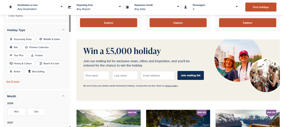
The result? Sign-up rate increased by 504.9%.
The learning? Sometimes the underlying idea is right, but understanding what motivates users helps us make the next iteration more effective.
A flat result still tells us something. It might mean the idea isn't right, but it could also mean the content is in the wrong place, the format is getting in the way or the message isn't compelling enough.
Experimentation isn't just about finding winning variations. It's about building a better understanding of users and using that knowledge to make more informed decisions.
By analysing results, challenging assumptions and iterating on initial ideas, we can uncover opportunities that might otherwise be missed.
A test that doesn't win isn't necessarily a dead end.


